alt-notify
Alerts, notification, whatever for Alt.
Introduction
alt-notify was designed to be unopinionated for almost any use-case. This means that you can use this library for your flashing notifications like Facebook’s or Twitter’s), or for simple alert messages, or whatever you can think of.
You can dish out the whole thing yourself, but that’s tedious, right?
Here are some examples of the use-cases (Hey, nobody said that these apps use this library, aight?).
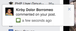
Facebook’s Notification Drawer
Dropbox’s Action Notification
Important Notes
alt-notify is undergoing active development, and will be released soon (the same goes for the documentation).
This library was primarily written for use for React and Alt. It will and does not try to cover everyone’s use-cases – the reason why it is and will be kept as simple as possible.
ES6
Currently, alt-notify, like alt itself, is written in ES6 and transpiled with Babel.
SemVer
Right now, this library is a work-in-progress, and will continue to have breaking changes (however follows SemVer) as long as necessary. Until v1.0, breaking changes will continue to bump v0.x. For example, v0.4.1 and v0.4.8 will have the same API, but 0.5.0 will have breaking changes.
Getting Started
Installation
For now, alt-notify is only available through npm:
npm install alt-notify --save* Note that the --save option persists alt-notify to your package.json.
To check which versions of React and Alt the library supports, please check Supported Dependency Versions.
Usage
First, we’ll import the Drawer component that the library exposes.
import React from 'react';
import { Drawer } from 'alt-notify';
Then, we’ll use it in our top-most component (usually the App component as we call it).
class App extends React.Component {
  render() {
    return (
      <div>
        <Drawer render={(props) => {
          return <div>{props.data}</div>
        }} />
      </div>
    )
  }
}
To add items in our Drawer component, we’ll import NotifyActions.
import React;
import { Drawer, NotifyActions } from 'alt-notify';
And then use it like so:
class App extends React.Component {
  render() {
    return (
      <div>
        <Drawer render={(props) => {
          return <div>{props.data}</div>
        }} />

        <button type="button" onClick={this.addNotification}>
          Add a notification!
        </button>
      </div>
    )
  }

  addNotification() {
    NotifyActions.add({ data: 'I\'m a message. Hello.' });
  }
}
This is how our code should look like now:
import React;
import { Drawer, NotifyActions } from 'alt-notify';

class App extends React.Component {
  render() {
    return (
      <div>
        <Drawer render={(data) => {
          return <div>{data.text}</div>
        }} />

        <button type="button" onClick={this.addNotification}>
          Add a notification!
        </button>
      </div>
    )
  }

  addNotification() {
    NotifyActions.add({ data: 'I\'m a message. Hello.' });
  }
}
Hopefully, now you have an idea on how to use the library.
Examples
A plethora of examples has been setup to help you get started. It’s some sort of cookbook or something. You can go ahead check it on our repository.
At the time being, a lot of examples are still in development and will be available soon!
API Documentation
Miscellaneous
Changelog
v0.3.4 (commit)
- Fixed build.
v0.3.3(commit)
- Removed Alt and React from
peerDependency.
v0.3.2 (commit)
- Fixed
package.jsonnot pointing to the recently added build files.
v0.3.1 (commit)
- Prepped up for npm.
- Added build files.
v0.3 (commit)
- Added autoremoval of items (our duration sarting to make sense here).
- Stabilized the properties received from the
Drawer(this was unclear inv0.2). Unnecessary properties received from theDrawercomponent are no longer exposed (id,duration, etc.). Add items through thedataproperty, e.g.,NotifyActions.add({ data: 'Hey', type: 'alert' });.
v0.2.1
- Fixed
configexport to be undefined. commit.
v0.2
* Tag was removed due to npm accepts 0.2.0 but not 0.2 (which was the one written in the file).
- Slightly changed
configexport for testability (I couldn’t stub it without having to do so). Bumped in case somebody importsconfigin an unnecessary fashion.configis now imported as howexport defaultormodule.exportsis imported,import config from 'alt-notify/config'instead ofimport * as config from 'alt-notify/config'. commit.
v0.1.1
- Version bump due to v0.1 tag being pushed without bumping
package.jsonversion commit.
v0.1
- Initial functional release.
Supported Dependency Versions
The version here will be bumped only if the support dependency version changes. For example, given the scenario that v0.1; v0.2; and v0.3 supports React v0.13 and Alt v0.15, while v0.4 supports a different version of React and Alt, only v0.1 and v0.4 will be noted.
| Version | React | Alt |
|---|---|---|
| v0.1 | v0.13 | 0.15 |


